Two halves, one conversation.
The Silah Desk mark, its name, colours and type, and how to use them. Everything here is free to download for press, partners and integrations.
Bond. Two people in one conversation.
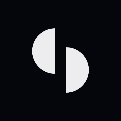
Two half-discs of the same size, facing each other and offset by half a radius. It is a pure symbol, so the same drawing serves as the logo, the favicon and the live-chat launcher.
Silah means connection.
Ṣilah (صلة) is the tie between people that is kept, not made once. It is the relationship a business should have with the people it serves, on whatever channel they choose. The desk is where that relationship is kept: one place for every conversation.
Always lowercase in the logo, with desk set lighter. In running text, Silah Desk: two words, never SilahDesk.
ṣilah: the bond you keep with family and community. Desk stays in Latin letters.
How the name is written for our Bengali-speaking customers.



Monochrome first. Colour is information.
If a screen still works in greyscale, it is right. The only hues are the signal accent, used in tiny doses, and the three status colours.
Background. The brand lives on black.
Surfaces, cards and panels.
The mark, text and primary buttons.
Secondary text.
The one accent: focus, live, selection.
Status only.
Status only.
Status only.
One family, two cuts.
Geist for everything people read. Geist Mono for code, figures in tables and small uppercase labels. No serif, and no italics for emphasis.
Every conversation, in one calm place.
Body copy sits at 15–17 px with slightly tight tracking. Short sentences, plain words, no hype.
silah.init({ key: "pk_live_…" })A few rules.
Keep clear space of one half-disc (a quarter of the mark's width) on every side, and never set the mark smaller than 14 px.
Silah Desk is a company of Mashriqain Group. For anything this page does not answer, get in touch.